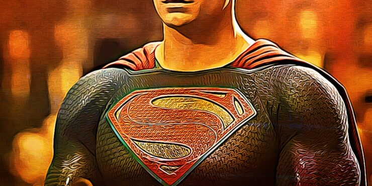
The Superman Logo is one of the most popular and most recognizable superhero symbols ever. There are many reasons behind this popularity and the symbol itself has a rich history. Because like Superman’s character evolution the meaning of this symbol also evolved over time. But one fact that you should know is that Superman is the first Superhero whose costume had been designed around a central symbol. And therefore the central symbol of Superman’s costume inspired the costume design of nearly all other future superheroes.
The Superman logo consists of an “S” enclosed inside a diamond shape. And was based on a shield in a coat of arms. The logo had numerous changes over the years and developed into a symbol with a complex meaning. In this article, we will look at the evolution of the Superman logo physically and also at the development of the logo as a symbol of hope.
History Of Superman Logo
The Superman logo was the first-ever logo on a superhero costume. The central design of this logo made it more appealing and also made it visible. This design element made this logo more noticeable. The idea of introducing a superhero with a dedicated logo was very well received by the readers at the time. And the simple yet effective design of this logo made more people attracted to the character ultimately boosting the sales of the Superman comics line.
The initial Superman symbol was a letter S with red and blue on a yellow police badge symbol that resembled a shield. This initial design was changed quite a few times over the next few “Action Comics” issues. The design change consisting of enclosing the S letter inside an inverted triangle. The size and shape of S and the triangle also varied in various Superman appearances as well.
Evolution Of The Superman Logo
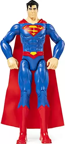
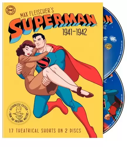
We further saw the physical changes in the Superman logo in the Superman TV Serial By Fleisher Studios. These cartoons saw the triangle in the Superman logo change to a diamond shape for the first time. The logo was black with a red S outlined with white (or occasionally with yellow). The shape and the size of the enclosed “S” and the outer diamond still changed from time to time. But this diamond-shaped design stuck with Superman and is in use even now.
The logo has retained the basic color palette with the shape of the logo occasionally changing. There have also been extreme cases where the logo is unusually big like in Lois & Clark: The New Adventures of Superman or noticeably smaller than the standard version like in Superman Returns (2006 Film). But the basis of all these iterations is the classic logo.
Modern Iterations of The Logo
The most notable modern design changes can be seen in the 2006 Film Superman Returns and the Snyderverse.
Superman Returns
Bryan Singer’s Superman Returns was controversial, to say the very least. It was universally panned by critics and fans alike. And such a negative reception led to the cancellation of any planned sequels in favor of a complete reboot of the character.
Brandon Routh’s Superman costume was also criticized for the small size of the Superman symbol. But one interesting fact that got overlooked was that this Logo was a raised insignia and consisted of several smaller logos embedded in it.
Snyderverse
Zack Snyder is a big fan of Easter eggs and everything in the Snyderverse is loaded with Easter eggs. The Superman logo in Batman v Superman: Dawn of Justice consists of a quote digitally printed inside the logo in Kryptonian language. The quote is actually from author Joseph Campbell and states “Where we had thought to stand alone, we will be with all the world.”
This quote is actually in line with Zack’s Superman iteration who is constantly battling with the idea of how to become a part of the society that is alienated by him.
Meaning of The Superman Logo
The meaning of the Superman logo has evolved much like the character himself. Initially, the logo stood for Superman only. But with time a deep meaning was introduced in Superman: The Movie. As per this movie, the logo was actually the coat of arms of the House of El on Krypton.
Later authors introduced the symbol as a sign of hope with Superman believing that the logo might have been the coat of arms for the House Of El but it evolved as a symbol of hope on Krypton. With the writer Geoff Johns confirming the logo as both.
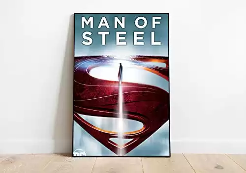
The Man Of Steel movie adopted the hope meaning of the Superman symbol. And under Zack Snyder’s direction, the logo was introduced as a symbol of hope. At the beginning of the movie, Clark’s father is also seen wearing this logo. And years later when Superman talks to his father’s consciousness aboard a Kryptonian Scout ship. Jor-El tells Clark that this logo is actually a symbol of hope.

Conclusion
If you liked this article then you should definitely visit our website www.batmanfactor.com to read other articles as well.